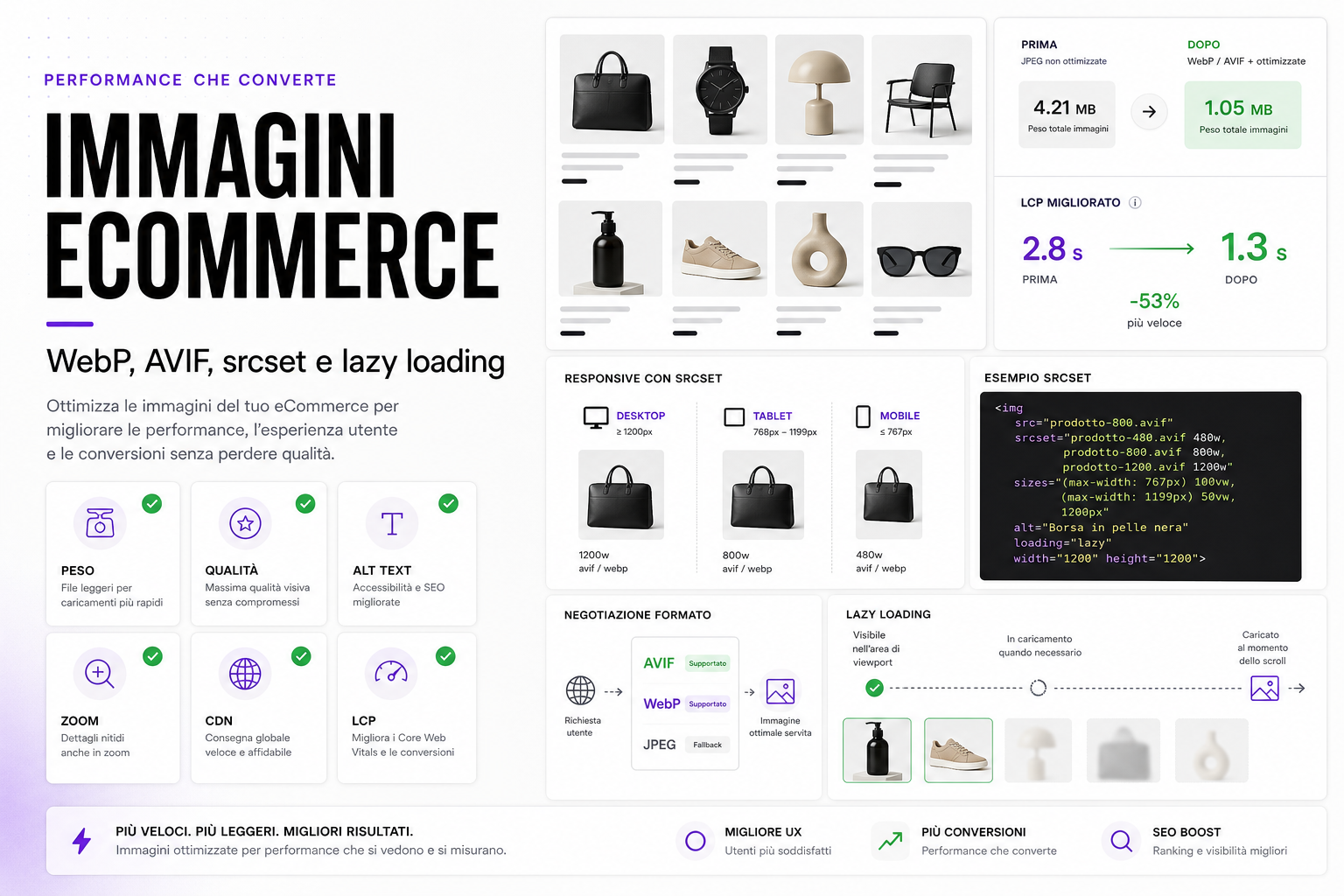
In an eCommerce store, images sell. But if they weigh too much they slow everything down: categories, product pages, homepage, blog, feeds and campaigns.
Optimising images doesn't mean making them ugly or tiny. It means serving every device the right format, at the right size, at the right moment.
WebP, AVIF, srcset and lazy loading exist precisely for that: keeping visual quality while cutting weight, improving Core Web Vitals, user experience and conversions.
Why images weigh so heavily on eCommerce sites
A brochure site may have a handful of images. An eCommerce store loads them everywhere:
- category listings;
- product pages;
- colour variants;
- product zoom;
- brand pages;
- promo banners;
- blog and guides;
- social and shopping feeds;
- images supplied by different vendors.
If every image is loaded in its original format, perhaps 2000 or 3000 pixels wide even on mobile, the site wastes bandwidth and time.
WebP and AVIF: modern formats, not magic
WebP and AVIF can cut a lot of weight compared with JPEG and PNG, but they have to be used properly.
- WebP: excellent browser support, a good quality/weight compromise.
- AVIF: often even better compression, but it needs careful testing on quality and generation times.
- JPEG: still useful as a fallback or for legacy pipelines.
- PNG: useful for transparency and graphics, often heavy for product photos.
- SVG: suited to logos and icons, not to product photography.
The best strategy isn't "just convert everything": it's building a pipeline that generates several formats and sizes, then serves the most suitable version.
srcset: mobile shouldn't download desktop images
srcset lets the browser choose the most suitable image based on screen, pixel density and layout.
For a product you can have different versions:
- 320 px for mobile thumbnails;
- 480 px for product cards;
- 800 px for the product page;
- 1200 px for desktop and light zoom;
- 1600 px or more for real zoom, only when it's needed.
This stops a phone downloading an enormous photo just to display it in a 160-pixel card.
Lazy loading: useful, but not on the wrong hero
Lazy loading loads images when they are needed, usually as they are about to enter the viewport.
On an eCommerce site it is very useful for:
- products below the first screen;
- long galleries;
- related articles;
- reviews with images;
- editorial content that isn't immediately visible.
But be careful: the main above-the-fold image, the one contributing to LCP, often should not be lazy loaded. It has to load early, with defined dimensions and the correct priority.
LCP: the main image decides how fast the site feels
Largest Contentful Paint measures how long the page's main element takes to become visible. On many eCommerce pages that element is an image: a hero, the main product shot or a large card.
To improve it:
- use the correct dimensions;
- compress without losing important detail;
- avoid lazy loading on the LCP image;
- set
widthandheight; - preload only genuinely critical images;
- reduce render-blocking scripts;
- use an effective CDN and cache.
Quality: don't ruin the thing that has to sell
Compression must not destroy trust.
On an eCommerce site some images have to stay very sharp:
- the main product photo;
- material close-ups;
- ingredient labels;
- packaging and pack size;
- zoom on texture, sizes, stitching or components;
- technical or compatibility images.
Optimisation has to be tested on real cases. If the customer can't read a label or see a detail, you have saved kilobytes and lost trust.
Alt text: performance and accessibility aren't enough on their own
Every important image should have useful alt text. There's no need to stuff it with keywords. The job is to describe the content when the image carries information.
Examples:
- "black leather bag with adjustable shoulder strap";
- "dry dog food in a 12 kg pack";
- "blue running shoe, side view";
- "close-up of the product ingredient label".
Alt text, file name and context all help accessibility, comprehension and the quality of the product page.
The ideal pipeline for eCommerce images
A well-built platform should automate as much as possible.
- Upload the original image.
- Check dimensions, weight and quality.
- Generate responsive variants.
- Convert to WebP and AVIF.
- Create a lightweight placeholder where useful.
- Write
srcsetandsizesautomatically. - Lazy load the non-critical images.
- CDN and cache.
- Monitor LCP and page weight.
This reduces manual work and stops every new product slowing the site down.
Common mistakes
- Loading enormous images and resizing them only in CSS.
- Using lazy loading on the main image too.
- Forgetting
widthandheight, causing layout shift. - Converting everything to WebP without quality testing.
- Having no fallback for unsupported formats.
- Using PNG for product photos with no reason to.
- Not distinguishing between thumbnail, card, product page and zoom.
- Not optimising blog or category images.
- Not measuring LCP with real-world data.
How we handle it at BitHub
On custom eCommerce projects we treat images as part of the platform, not as a one-off manual job.
That means an automated pipeline, responsive variants, modern formats, stable dimensions, attention to LCP, alt text and visual quality. If the catalogue grows, the system has to keep producing correct images.
The topic connects to the Green Web Audit, eCommerce Core Web Vitals, product image recognition and custom eCommerce.
Useful sources
On formats, responsive images and loading we drew on the MDN documentation on image formats, the MDN guide to responsive images and the web.dev guide to browser-level image lazy loading.
FAQ
Do WebP and AVIF always improve speed?
Often yes, but it depends on the pipeline. Correct dimensions, srcset, cache and lazy loading count just as much as the format.
Should I convert every image to AVIF?
Not necessarily. AVIF can be excellent, but it has to be tested on quality, compatibility, generation times and fallbacks.
Should lazy loading go on every image?
No. Below-the-fold images yes, but the main image that affects LCP usually has to load immediately.
Is srcset really necessary?
Yes, especially on eCommerce sites with lots of product cards. It stops desktop images being served to mobile devices.
Do images affect conversions?
Yes. Faster images improve UX, but they have to stay sharp and informative so you don't lose trust and product detail.
Want to lighten your eCommerce store without ruining the images?
We can analyse image weight, LCP, formats, srcset, lazy loading and visual quality to build a faster, more stable pipeline.