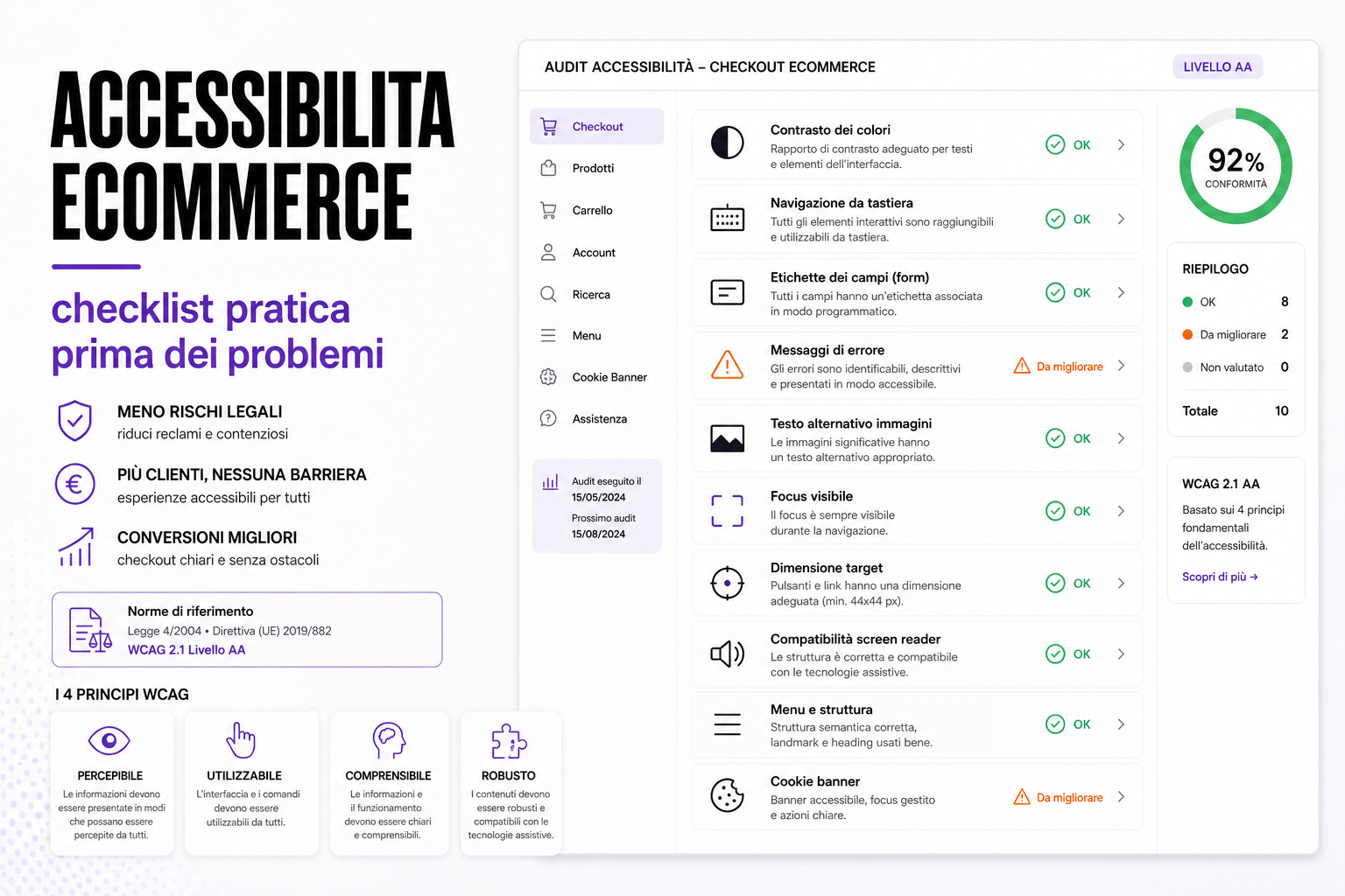
Accessibility is not only a legal matter. On an eCommerce site it means letting more people find products, understand information, complete orders and ask for help without pointless obstacles.
Accessibility should be considered alongside the platform itself; see our eCommerce development service.
Plenty of shops discover the problem late: after a complaint, a formal grievance, an audit, a request to bring the site into line, or a drop in conversions on mobile and at checkout. Yet the most common problems can be found earlier, with a concrete checklist.
An accessible eCommerce site is not a "simplified" site. It is a better designed one: readable text, clear buttons, understandable forms, explained errors, keyboard navigation, described images and a checkout that does not block people using assistive technology.
Why accessibility is also a sales issue
Every barrier in the interface can turn into a lost order.
- Contrast that is too low makes prices and CTAs hard to read.
- A form without labels creates confusion at checkout.
- An error that isn't explained blocks the payment.
- A menu you cannot navigate by keyboard stops people reaching categories.
- A badly built cookie banner covers content or traps the focus.
- A button that is too small makes buying on mobile difficult.
- An image with no alt text communicates none of the information it carries.
Accessibility, UX and conversion are not three separate things. Very often the fix that helps a person with a disability also helps users who are tired, older, on mobile, on a slow connection or in less than ideal conditions.
Checklist: contrast and readability
The first check is readability.
- Do text and prices have enough contrast against the background?
- Are placeholders kept out of the role of field labels?
- Is small text genuinely readable on mobile?
- Are links and buttons clearly distinguishable?
- Are the hover, focus, error and disabled states visible?
- Do promotions avoid using colour alone to signal urgency or a discount?
If you have to squint to read a CTA, that isn't a graphic detail: it is a commercial problem.
Keyboard navigation and visible focus
A site has to be usable without a mouse too.
Check that:
- menu, filters, search, basket and checkout can all be reached with Tab;
- the focus is always visible;
- the focus order follows the logic of the page;
- modals, menus and cookie banners do not trap the user;
- a window can be closed from the keyboard;
- there are no elements that are invisible but still focusable.
Invisible focus is one of the most widespread mistakes: the user moves, but has no idea where they are.
Forms and checkout: the most delicate point
Checkout is where accessibility turns into revenue.
- Every field has a label associated with it.
- Errors are described next to the field they belong to.
- Errors are announced in an understandable way.
- The required format is clear: phone number, postcode, VAT number, email.
- Mandatory fields are marked unambiguously.
- The content of the form is not lost after an error.
- The "continue", "pay" and "apply coupon" buttons are clear.
- The order summary stays understandable on mobile too.
An accessible checkout cuts support requests, abandonment and frustration.
Images, alt text and product pages
Product images are essential. But some information must not live only in the photo.
- Informative images have useful alt text.
- Decorative images can have an empty alt attribute.
- Colour, format, size and pack are written in the text as well.
- Colour variants can be identified without relying on colour alone.
- Zoom images are not the only way to read important details.
- Video and multimedia content have alternatives where needed.
This also connects to the work on optimised eCommerce images and product image recognition.
Menus, filters and internal search
An eCommerce site lives on navigation: categories, filters, search, sorting, pagination, mobile menu.
Things to check:
- filters can be selected from the keyboard;
- checkboxes and radio buttons have clickable labels;
- the number of results is communicated clearly;
- pages with no results offer alternatives;
- the mobile menu is readable and navigable;
- internal search communicates errors, suggestions and empty results;
- active filter states are not signalled by colour alone.
Filters and search are often designed only for mouse and desktop users. On mobile and with a keyboard, plenty of problems come to the surface.
Cookie banners and modals
The cookie banner is one of the most underrated points.
- Can the banner be reached from the keyboard?
- Does the focus enter and return correctly?
- Are the buttons clear and distinguishable?
- Is the text readable on mobile?
- Does it avoid covering content without allowing a choice?
- Does it avoid creating unmanageable scrolling or overlays?
A badly made banner can create two problems at once: poor accessibility and broken tracking. We cover this in the article on cookie banners, Google Ads and Analytics.
How to start without rebuilding everything
Rebuilding the site is not always necessary. It is usually better to start from the high-impact areas.
- Homepage and main menu.
- Category pages and filters.
- Product page.
- Basket.
- Checkout.
- Login and registration.
- Cookie banner.
- Contact and support forms.
Every fix has to be verified with automated tools and manual checking. Automated tools help, but they do not find everything.
Useful sources
In putting this checklist together we drew on the W3C's WCAG 2.2, the WAI documentation on the principles of accessibility, and EU Directive 2019/882, known as the European Accessibility Act.
FAQ
Does accessibility apply to small eCommerce sites too?
Yes. Even where there is no immediate specific obligation, making checkout, forms and navigation more accessible reduces friction and improves the quality of the experience.
Is installing an accessibility plugin enough?
No. Plugins can help with some aspects, but they do not fix bad markup, forms without labels, checkout errors or flows that cannot be navigated.
Are automated tools enough?
No. They are useful, but you also need manual testing with a keyboard, on mobile, with a screen reader, and checks on the real flows.
Where is the best place to start?
Checkout, forms, mobile menu, search, filters and cookie banner. These are the areas with the highest impact on sales and complaints.
Can BitHub run an accessibility audit?
We can check key pages, components, checkout, forms and banners, then put together a prioritised list of fixes.
Want to know where your eCommerce site creates barriers?
We can run a practical check on the pages that matter: product, category, basket, checkout, forms and cookie banner.